
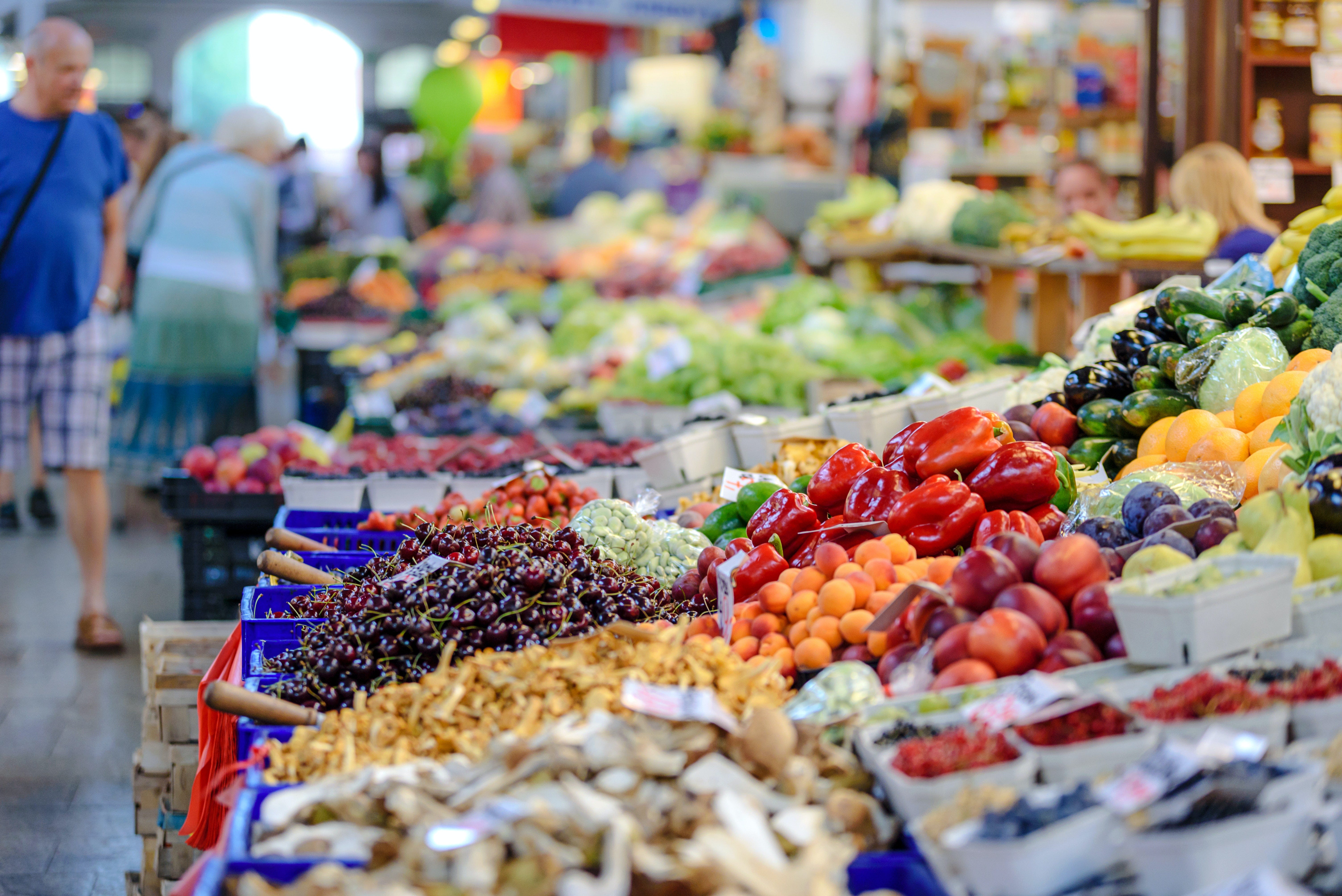
A food inflation analysis using Canadian data

There are reports of food prices increasing at their fastest pace on record.
Food prices have risen their fastest annual rate in more than 30 years driven by sharp increases in groceries, fruits and vegetables.
Fruit and vegetables drove the monthly increase, up close to 6 percent, with small rises for meat and groceries.
However, the annual increase was caused by a 12 percent gain in grocery prices, notably eggs, cheese and potato chips.
Fruit and vegetables prices increased by 23 percent over the year, with tomatoes more than doubling price and potatoes rising by half.
— Food prices rise at fastest annual rate in more than 30 years, RNZ (Mar. 13, 2023)
Related:
Inflation rate slows to 6.3% — but groceries are still going up at nearly twice that pace
CBC (Jul. 17, 2022)Canadian food suppliers warn grocery chains more price hikes are coming
CBC (Jul. 13, 2022)
Unfortunately, this is nothing new.
Price increases are more publicly visible only because the inflationary period is decreasing, which causes costs to rise more rapidly. In the following analysis, I will demonstrate how food inflation has been baked into the cake for a long time.
Please note — I use Canadian data based on familiarity. This same approach be done for other countries using regional data. Inflation is a global issue and this analysis should be revealing regardless of where you live.
This is a simple analysis to demonstrate the Consumer Price Inflation (CPI) present in Canadian food prices from Statistics Canada composite data.
Please recognize the following limitations:
Statistics Canada is a government entity.
It is therefore susceptible to political influence and bias.Datsets provided are effectively blackbox.
There is no ability to publicly view raw data and verify datasets.Date ranges vary within the datasets.
Datasets are not comprehensive with respect to date.
The analysis does not discuss Monetary Inflation, which is the source of Consumer Price Inflation. Such analysis would compare the dollar value of wages and goods / services relative to the money supply (e.g., M1, M2, M3 if available and total debt).
The following analysis focuses on:
Food prices.
Cost of food in CAD dollars over time.Average wages.
Cost of food by income over time.Commodity prices.
Cost of food by commodities over time.
I. Retail prices for food and selected product(s)
Canadian food prices are obtained from the Statistics Canada: Monthly average retail prices for food and other selected products dataset available online.
To obtain the dataset:
Navigate to the above Statistics Canada website.
Select Download options.
Select Download entire table “Monthly average retail prices for food and other selected products,” which returns the 18100002-eng.zip compressed archive.
The extracted archive contains a CSV file and metadata.
Please see footnote1 for a description of the analysis environment.
This dataset contains 15 columns; the following columns are used:
REF_DATE.
Represents the date index, which is from Jan. 1995 to Feb. 2022 (i.e., not the most recent).Products.
Represents an individual retail product — there are 62 products in total.VALUE.
The price of the product as a decimal.UOM.
The unit of measure, which is in Canadian Dollars.
Each product is plotted along a date axis. The price of the product is graphed on the left axis. A 6 month rolling average and 6 month rolling standard deviation range is used to visually smooth out the data in orange.
A calculated percent increase (CPI) is graphed on the right, which is relative to the first data point (i.e., CPI changes based on starting date). This visually illustrates the total percent increase for each product within during the selected period.
Below are 4 samples in Figure I-1, Figure I-2, Figure I-3 and Figure I-4 to demonstrate the variation and variety of products within the dataset.

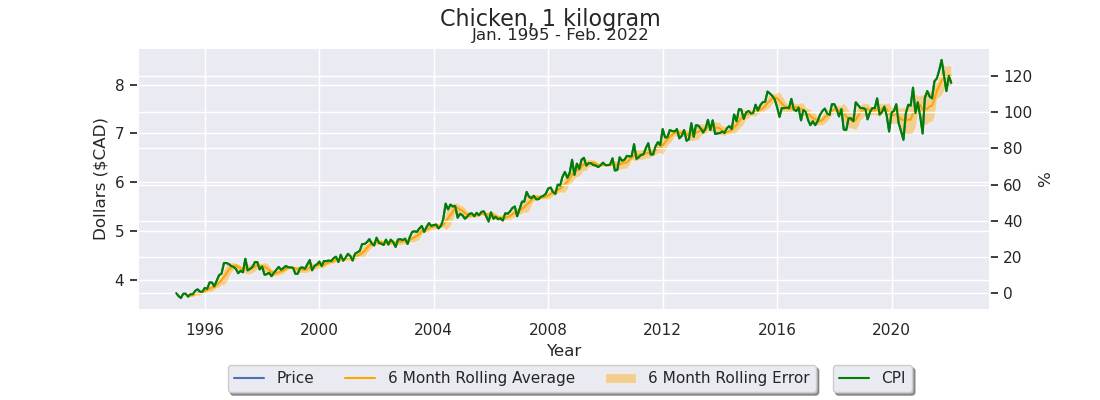

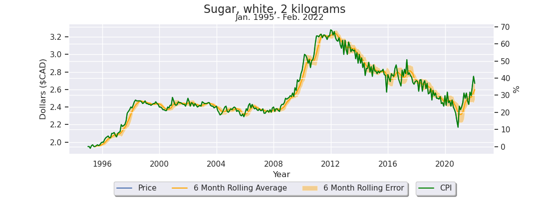
As seen from the above examples, there is a wide variation in price fluctuations over the time period. Milk had an 80% increase, Chicken had a 116% increase, Cigarettes had a 380% increase and Sugar had a modest 38% increase.
This is clear evidence of a large price increase within the last 27 years.
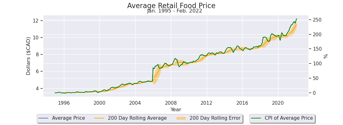
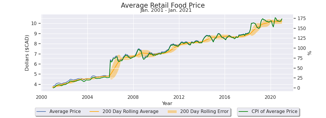
The aggregate price increase is visualized by using the average price of all products over the period. This is illustrated in Figure I-5, which shows a 255% increase in the average price of all products. Please consider that limitation 3. likely skews these results.
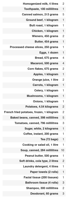
To increase realism, a Simulated Grocery Basket (referred to as Basket) is created to mimic a trip to the grocery store during the dataset period. The Basket is shown in Figure I-6 where the right column is Product and the left column is Quantity.
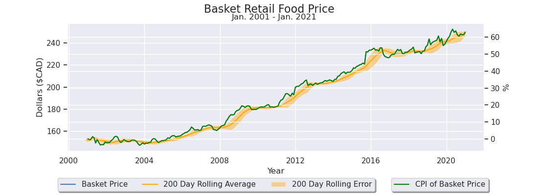
The Basket is aggregated to produce a simulated grocery bill (i.e., Basket Price). Basket Price is graphed in Figure I-7 to show the total price on the left axis and its percent change (CPI) on the left axis.

Using the Simulated Grocery Basket, the estimated grocery bill increased by 80%.
The Basket technique provides a “low ball” of overall price increases as it excludes fuel, housing, products like cigarettes and other expenses.
It effectively illustrates a baseline cost of living increase.
Why?
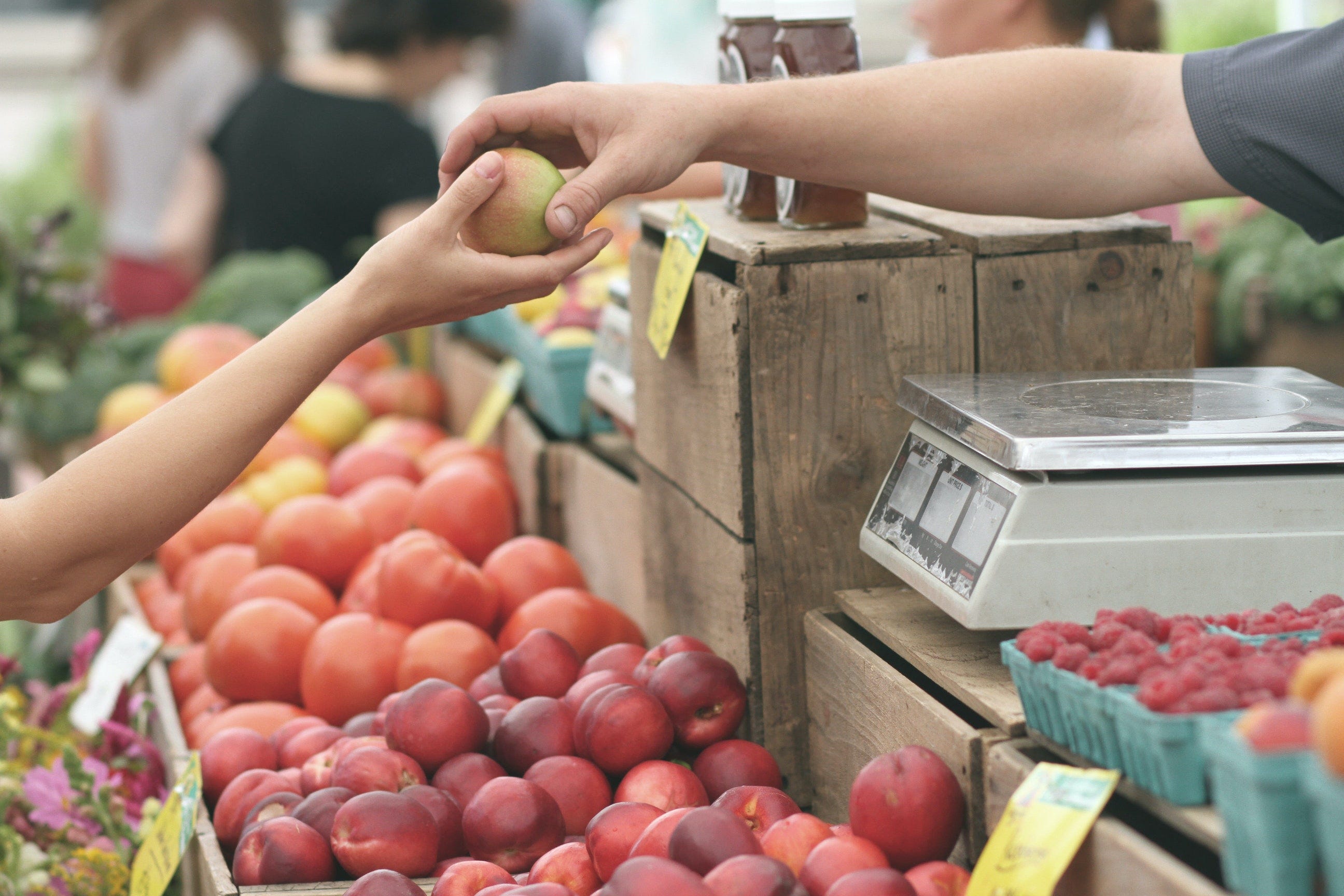
Everybody needs to eat.
II. Wages relative to retail prices
Canadian weekly wages are obtained from the Statistics Canada: Average weekly earnings by industry, annual dataset available online.
To obtain the dataset:
Navigate to the above Statistics Canada website.
Select Download options.
Select Download entire table “Average weekly earnings by industry, annual,” which returns the 14100204-eng.zip compressed archive.
The extracted archive contains a CSV file and metadata.
This dataset contains 17 columns; the following columns are used:
REF_DATE.
Represents the date index, which is from Jan. 2001 to Jan. 2021 (i.e., not the most recent).GEO.
National or provincial / territorial data.Type of employees.
All, salary or paid by hour.Overtime.
Includes overtime / excludes overtime.North American Industry Classification System (NAICS).
The labour groups, including aggregates. 395 are in the dataset.VALUE.
The wage as a decimal.UOM.
The unit of measure, which is in Canadian Dollars.
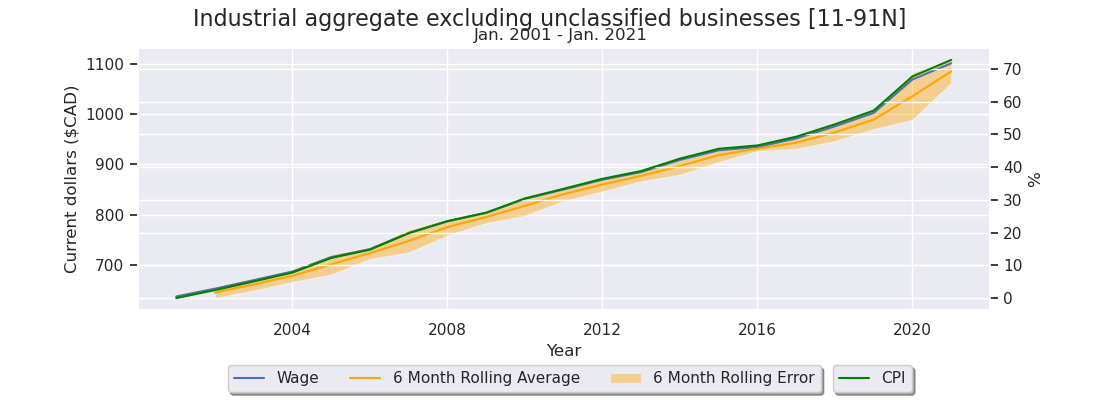
The approximate average of all industries is the “Industrial aggregate excluding unclassified businesses” field, which is a summary group in the North American Industry Classification System (NAICS) column.2
Sub-groups (i.e., specific jobs) of NAICS include:
Goods producing industries.
For example:
Construction.
Manufacturing.
Service producing industries.
For example:
Finance and insurance.
Accommodation and food services.
The dataset is filtered by Overtime=Excluding overtime, Type of employees=All employees and GEO=Canada to get the highest level NAICS aggregate.
For Figure II-1, the date axis is plotted between 2001 to 2021, because of dataset limitations. The left axis is in Canadian dollars and the right is the percent increase anchored from the first data point (i.e., 2001).
According to Statistics Canada, the average aggregate weekly earnings has risen over 70% in the past 20 years. This is approximately a 2.89% raise per year.3 This number is suspiciously close and above the so-called 2% inflation target and likely does not reflect true aggregate wage growth in reality.4
The 70% wage growth is compared with the Basket from the food and other selected product(s) dataset in Section I. Figure II-2 illustrates that the Basket Price only rose by 60% (2.56% per year) and thus ‘average wages out performed grocery prices.’
However examining Figure II-3, it is clear there are enough items excluded from the Basket that have significantly out performed wage growth, because the average of all items has risen 175% (5.47% per year). e.g., Stewing beef, 1 kilogram (2001-2021: 154%).
(Assuming a discontinuity at 2006 [limitation 3.], the average still increases to around 125%).
Assuming wage growth is overstated and retail prices are understated then it is reasonable to assume Basket Price likely outperforms wage growth.
This assumption becomes visible when examining5 specific wages as per Figure II-4, which indexes Basket Price relative to wage growth to determine affordability loss.
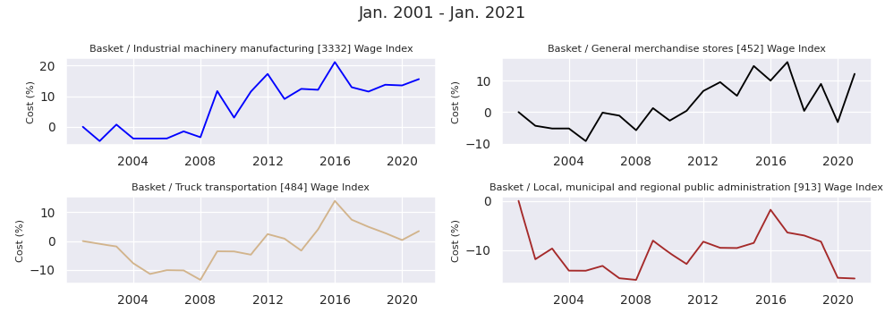
Industrial machinery manufacturing [3332] (+16%).
Basket Price increased by 16% relative to earned wage.General merchandise stores [452] (+12%).
Basket Price increased by 12% relative to earned wage.Truck transportation [484] (+4%).
Basket Price increased by 4% relative to earned wage.Local, municipal and regional public administration [913] (-15%).
Basket Price decreased by 15% relative to earned wage.
This demonstrates that many earned wages are deteriorating relative to food prices.
(Except for some jobs like government …)
If individuals are using savings or are on a fixed income then their standard of living is significantly deteriorating relative to food prices.
‘Wages have kept pace with the cost of living’ is fallacious and deceitful claim.
III. Commodities relative to retail prices
Currency units are the nominal unit for measuring value.
Money is traditionally considered the most marketable commodity, i.e., a commodity with the broadest base of buyers and sellers. Currency is a convenient transaction substitute that is redeemable in monetary units.
Using this concept, the commodity equivalent grocery price is calculated to estimate if food priced in other commodities has the same upward trend as dollars. For coverage, this also includes a composite stock index.
(i.e., If I could pay in lumber, coffee, gold, silver, etc. do grocery prices increase?)
This is performed using the following Yahoo Finance exchange trading symbols.
S&P 500.
^GSPCOil Futures.
CL=FLumber Futures.
LBS=FCoffee Futures.
KC=FWheat SRW Contract.
ZW=FSugar No. 11 Futures.
SB=FSilver (toz).
SI=FGold (toz).
GC=F
This analysis6 uses a fixed CDN conversion of 0.76 CAD / USD to simplify the calculations. A dashed red line is drawn from the first data point to demonstrate how the commodity performs over time relative to an initial purchase date.
Figure III-1 illustrates a relatively flat correlation to the Basket Price for the S&P 500, Oil, Lumber and Coffee over the 2000 to 2022 period. This implies that groceries were approximately at the same affordability level relative to these commodities if held, but were unstable on a shorter time scales.
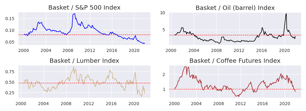
Figure III-2 illustrates a decreasing correlation to the Basket Price for Wheat, Sugar, Gold and Silver over the 2000 to 2022 period. This implies that groceries became more affordable relative to these commodities if held. Wheat and sugar were less stable on a shorter time scale than gold and silver.
Gold has the lowest volatility and is the most stable over time.

The last two graphs are important to understand.
These two graphs demonstrate that in the economic environment from 2000 to 2022 the standard of living increased if individuals either held or were paid in gold / silver. Before 1965 coinage use to be 80% silver in Canada and 90% in the United States.
(i.e., For example, to buy groceries in 2000 it was 0.4 toz of gold, but only 0.1 toz in 2022).
If coinage did not change and countries remained on a gold / silver redeemable currency then there would likely be no net price increase for groceries.
Conclusions
There are some concerns after exploring Statistics Canada datasets.
Food data does not capture brand changes, additional taxes / fees or quality.
(In my experience, prices have gone up much more and quality is down).Wage data feels off and is likely optimistic or biased.
(It’s also messy).Data discontinuities add error to aggregates.
Extrapolation / interpolation may fill gaps depending on data context.
Specialized aggregates and multiple simulated samplings would yield more accuracy.
(Basically the datasets need to be remodelled).
Section I
Notice there is no “pullback” or reversal for food prices over the time period.
This implies that food prices will continue to go up!
Local food production and self-sufficiency are important, because it will be a requirement in the future as affordability decreases.
Do not be distracted by Big Brother’s so-called ‘help.’
The federal budget, set for Tuesday, will include a grocery rebate measure aimed at lower income Canadians to help address the affordability crisis, particularly to mitigate the rising cost of food, CBC News has learned.
"It's being called a grocery rebate," said the source, but noted the rebate amount will not be based on a person's grocery expenditures, nor will the government require that the one-time payment be spent on groceries.
"It's a targeted measure that won't add fuel to the inflation fire," said the source.
— Tuesday's budget to include grocery rebate for lower income Canadians: source, CBC (Mar. 27, 2023)
This will add more fuel to the inflation fire as more dollars chase less goods.
Section II
It is safe to say that the average wage earner will continue to see a drop in food affordability, which implies that earning an income in the local currency will not be enough to keep up with inflationary pressures.
If people wish to continue to have access to good food they will have to start growing their own or trading real goods and services with local producers.
Section III
Saving and payment in goods or services, shown through the commodity samples provided, demonstrates either a neutral or net positive increase in real wealth. This is why gold and silver was — and still is — considered real money.
Having real goods and services that are marketable (buyable / sellable) is equally if not more important to manage this inflationary phenomenon.
Remarks
We are being robbed by saving and receiving payments in the local currency.
It cannot be seen directly except through data analysis or experience. I hope these results encourage you and your loved ones to seriously consider self-sufficiency and local market participation.
I highly suggest double checking my conclusions and analysis yourself.
However — I suspect that based on real world experience you know these graphs are perhaps understating the inflationary issue.
Wealth inequality is exacerbated by monetary inflation.
The sooner more realize this the sooner society can move forward.

Equations
eq. II.1 — Rate period conversion
eq. II.2 — Wage index conversion (as percent)
eq. III.1 — Commodity index conversion
The analysis was performed using Python 3.9.7, JupyterLab 3.2.1 and pandas 1.3.4. Visualizations used packages ipywidgets 7.6.5, matplotlib 3.4.3 and seaborn 0.11.2. The package yfinance 0.2.13 was used to pull commodity prices from Yahoo Finance. To perform the analysis yourself, consider using Excel unless you are comfortable with Python.
A weighted average based on workforce participants per category would likely be more appropriate, but is not present in this dataset.
(eq. II.1) Percentage increase per year is exponential to percentage increase per window.
After sifting through the data, it appears that blue collar work tends to be around 60-50% (e.g., Truck transportation [484] is 58%) and there are a lot of discontinuities within the 395 groups. 70% as an aggregate is definitely on the high side.
(eq. II.2) Cost of groceries indexed by wage as a percent.
(eq. III.1) Cost of groceries indexed by a commodity; returns units of commodity or ticker.
I'm writing my piece this week about the financial crisis. Thanks for the good info here. Good brainstorming for me. If I use any of your points and references, I will link to here.
Please consider that limitation 3. It skews these results.